Improving usability in a military app

Client
Improving usability in a military app
Services
Mobile App
Design System
Product Designer
End-to-End
Year
2025
Infos
Propagate is an application built for the United States military sector, designed specifically to serve firefighters, military personnel, and tactical field operatives. The core function of the app is to bridge communication gaps by connecting a user's smartphone to their radio, drones, and other essential field equipment, while also enabling seamless integration with the government-provided TAK (Team Awareness Kit) application.
40%
reduction in the time required to complete key tasks and actions within the app.
+25%
increase in successful task completion throughout the user journey.
30%
fewer clicks needed, streamlining the experience and making user interactions more efficient.
Problem
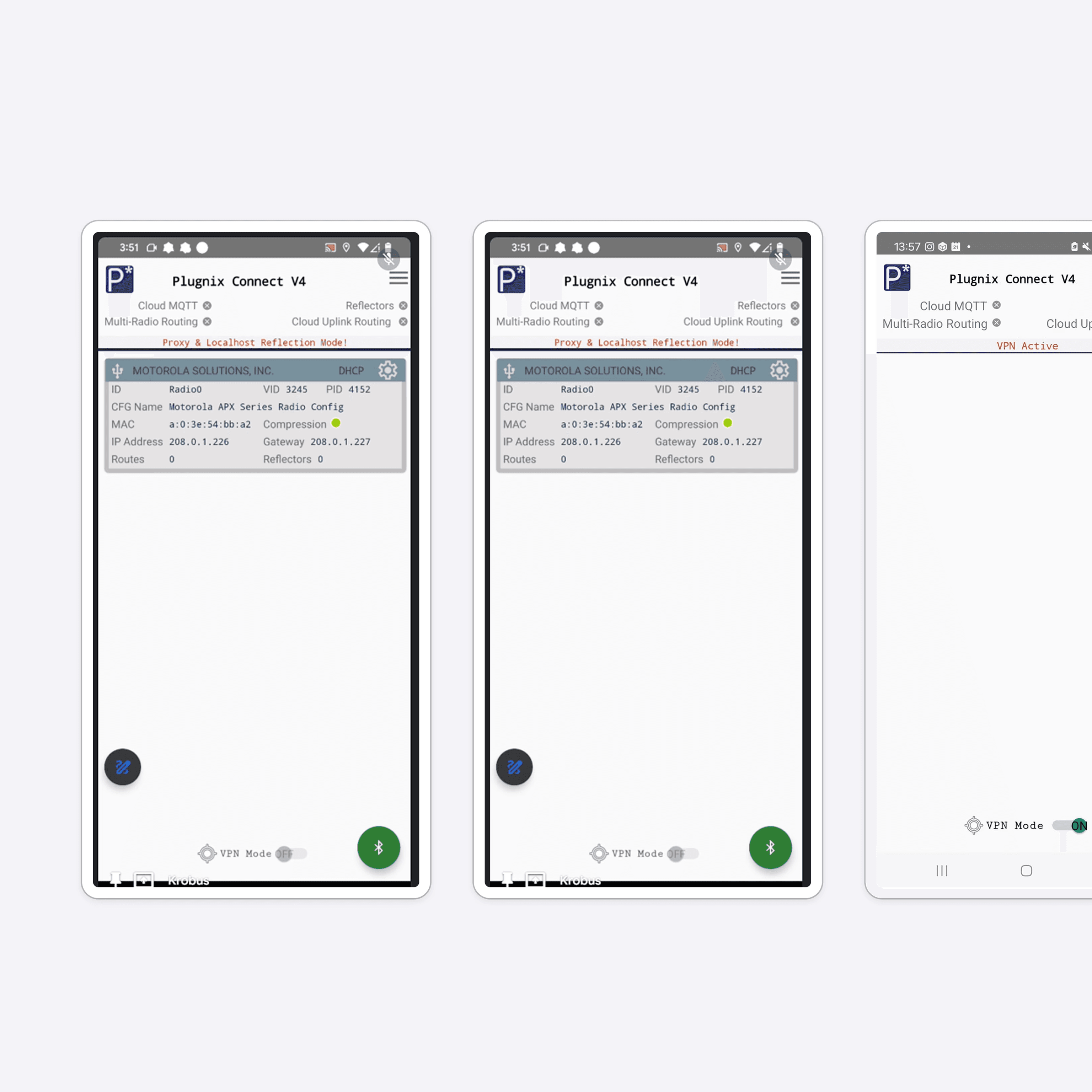
The initial version of Propagate was engineered directly by the front-end team with minimal UI/UX investment. In a field where seconds can dictate mission success, the app fell dangerously short. Key actions were buried deep within hidden menus, user flows were convoluted, and there was a severe lack of standardization, forcing users to rely on their own workarounds to complete basic tasks. The primary challenge we faced as a team was retrofitting a clunky, engineering-led interface into an intuitive, high-speed tool. Field operatives operate in high-stress, unpredictable environments; they simply cannot afford to struggle with poor visual feedback, complex navigation, or unoptimized interfaces while wearing tactical gear.

Time to Delivery
6 months
Squad Structure
3 Product Designers, 2 Developers
Process
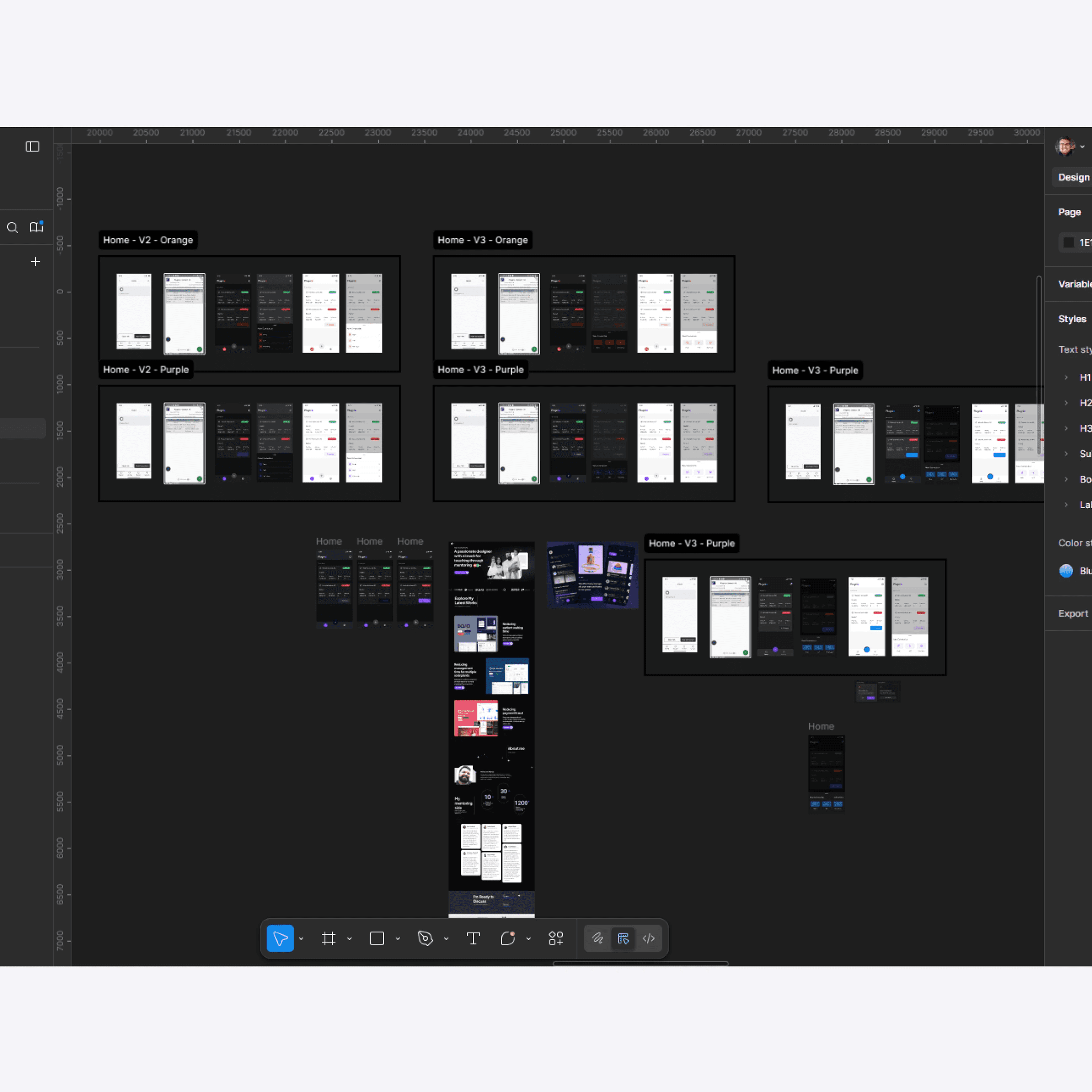
Working end-to-end across the product's lifecycle, I initiated the redesign with comprehensive user research to map out how different service areas interacted with the app. Through user interviews and usability analysis, I identified critical heuristic violations — primarily a lack of system feedback and highly inefficient task flows. Armed with this qualitative data, I moved into discovery and ideation to define new, streamlined user journeys. I mapped out specialized, step-by-step connection flows for each specific piece of hardware (radios, drones, etc.), ensuring the cognitive load on the user was kept to an absolute minimum. During the UI design phase, I architected a robust design system from the ground up. To ensure the UI could scale effortlessly, I managed complex variable structures across primitive, semantic, and component layers within Figma. Knowing the harsh physical conditions our users face, I also conducted rigorous WCAG accessibility audits on the mobile layouts. I heavily optimized contrast ratios to combat outdoor glare and ensured target touch sizes were large enough for rapid, gloved interactions. Finally, the handoff was highly structured, providing the development team with meticulously documented connection flows and component guidelines to bridge the gap between design and front-end execution.


Solution
The redesigned Propagate application delivered a standardized, highly efficient interface built entirely around the physical reality of field operations. By establishing clear connection journeys and a scalable component library, we significantly reduced the friction between users and their critical equipment. The value generated for the company was immediately measurable during post-launch testing with stakeholders: - 40% reduction in the time required to complete key tasks and actions. - 25% increase in successful task completion rates across the user journey. - 30% fewer clicks needed to navigate the app, streamlining the experience for high-pressure moments. By executing on this project from foundational research through to structural handoff, the final product evolved from a rudimentary proof-of-concept into a reliable, mission-ready asset that empowers operatives to focus on their job rather than their software.


